Enterprise SaaS · No-code builders · Research · User experience · Visual design
Turning a hard-coded admin platform into visual, no-code builders.
Meydan Free Zone runs every licence and visa application on EZMS. How each one moved was hard-coded, so every change needed a developer. I led the admin redesign that put those rules on screen.
- Role
- Senior Product Designer, NetBramha. Admin track lead
- Team
- A design lead, 4 UX designers, 2 visual designers
- Timeline
- 6 months, 2 weeks in Dubai, 2024
- Status
- Signed off and handed over, April 2024
The client. EZMS is the platform behind Meydan Free Zone: a customer portal, a staff portal, and an admin where the zone's own team builds every service.
In short. Each service's rules lived in code, spreadsheets, a slide deck and people's heads. I gave every rule a place on screen and designed the builders that let admins change them.
10 admin modules and about 700 screens, tested with two admins.
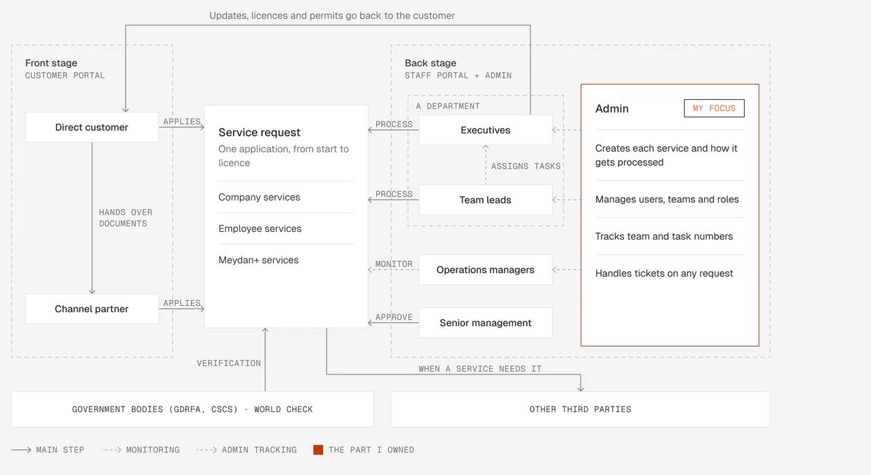
The job. Admins design the route every application takes.
Customers apply up front, staff process behind the scenes, and admins decide how every request moves between them.
Seven designers, two countries.
Designers in India, stakeholders in Dubai, and weekly admin reviews.
- 01Design team
- A lead, 4 UX and 2 visual designers. I owned Admin.
- 02EZMS team
- Product and engineering, who owned the data model.
- 03Meydan teams
- Reviewed every admin module, usually within two days.
My part. Senior Product Designer, admin track lead
- Owned the admin track from research to visual design
- Ran field interviews in Dubai
- Planned and ran the strategic workshop and the design thinking workshop
- Turned the research into findings
- Information architecture and wireframes
- Admin component library
- Admin visual design
Every new service needed a developer. Two weeks of research showed why.
We met every team, then looked closely at the admins who set every service up.
The research in seven steps, from brief to direction
- 01The briefMeydan’s three goals
- 02MethodsInterviews and two workshops
- 03People80 people, 38 sessions
- 04PersonaThe admin, up close
- 05Synthesis76 admin notes
- 06Findings6 admin pain points
- 07Direction5 pillars, 3 principles
Meydan’s brief, and the goal my track owned
1 dayto launch a new service, with no developer
Also on the brief
- Fewer steps for customers and staff
- Every conversation in one place
- A dashboard for each role
Three research methods, compared side by side
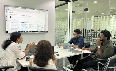
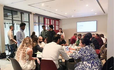
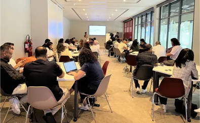
Two weeks in Dubai, customers to senior managers
Most sessions ran in Dubai. I also sat through the old admin’s training.
- days of research
- 11
- sessions: interviews and workshops
- 38
- people we spoke to
- 80
- hours of sessions
- 70+
7 user types, admins were mine
Front stage
- Direct customers
- Channel partners
Back stage
- EZMS admins (my focus)
- Senior management
- Operations managers
- Team leads
- Entry users
The admin: strong on process, held back by the tool
- Persona
- AdminBack stage
- Digital literacy
- 5 out of 5
- Process literacy
- 4 out of 5
- Tool proficiency
- 3 out of 5
- Works online
- 4 out of 5
- Works offline
- 1 out of 5
Six admin pain points.
- A complex interface
- A tedious form builderNeeded a developer
- A workflow with no visualNeeded a developer
- A static dashboard
- Confusing terms
- No test environment
The brief said menus. The research said rules.
In the research readout I showed the real blocker: rules nobody could see. Meydan agreed to fix those first, and the menu got tidied too.
We gave every hidden rule a place on screen, in words admins already used.
A zone can't launch a service in a day if its rules are hidden. Each rule needed a home the admin could see and change.
Three pillars set the direction
- Accuracy
- Efficiency
- User centricity
major pain points, each given a home on screen
What admins struggled with, how it worked before, and what it became.
| Pain point | Before | After |
|---|---|---|
| A complex interface | 24 menu items in one long list | 6 menu groups, intuitive user flow |
| A tedious form builderNeeded a developer | Slide decks, Excel and a fee calculator | One setup page for fields, edit rights and a fee formula |
| A workflow with no visualNeeded a developer | Routes hard-coded by developers | A flow map, plus a step list |
| Confusing terms | A login for each job | Plain names, and several roles on one login |
| A static dashboard | No record of who changed what | Services, tasks, an activity log and version history |
| No test environment | Only a live version | Development, testing and live versions |
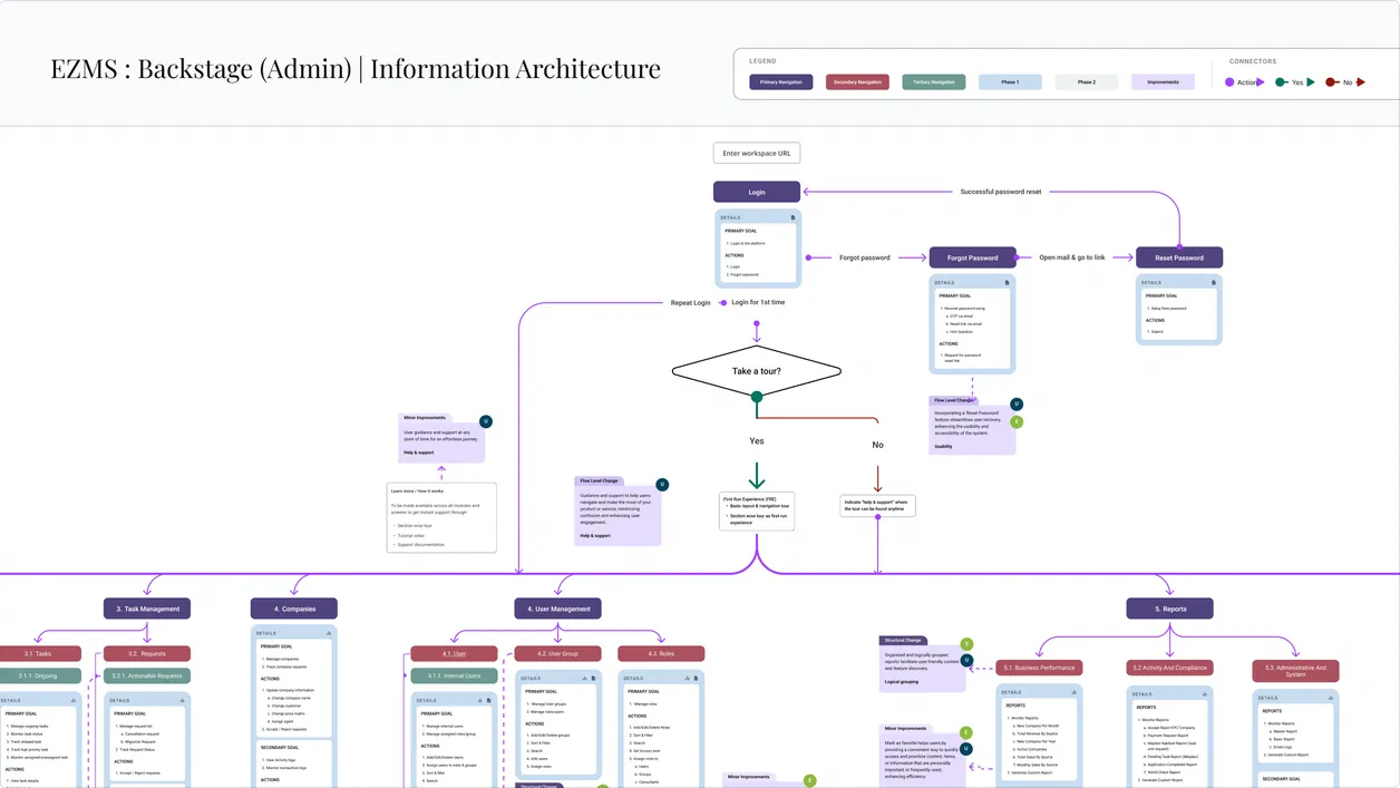
Every rule got a screen, so no one waits on a developer.
It starts with the sidebar, then the three builders that carry most of the change: services, workflows, and users and roles.
The admin. Everything a zone runs, in one sidebar
Services and processes, content, tasks, team performance, invoices, the directory, users and roles, reports and configuration: 17 menu items, down from 24 in one long list. Organisation setup, shown here, is one of them.
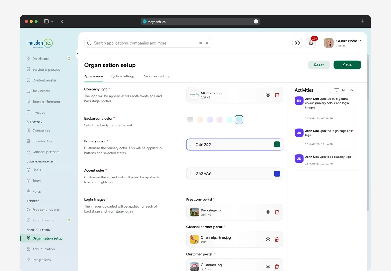
- Grouped by jobDirectory, user management, reports and configuration each get a labelled group, so admins scan by task.
- A builder behind each oneServices, forms, workflows, roles and reports are made on screen. The next sections show how.
- The brand tooLogo, colours, login images and links for every portal, changed in Organisation setup and saved.
- Configuration in one placeOrganisation setup, administration and integrations sit together at the foot of the nav.
Workflow builder. The whole route on one map
The live flows lived in slides and code, and only developers could change them.
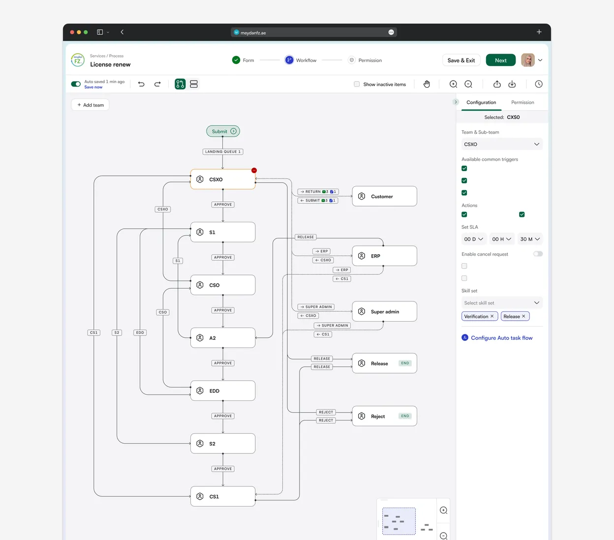
- Teams, in orderApprove sends the application to the next team.
- Back to the customerReturn it for changes, then take the resubmit.
- Two ways to endEvery route finishes in a release or a reject.
- Rules for each teamTriggers, actions and a time limit, set on the side.
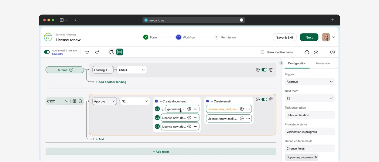
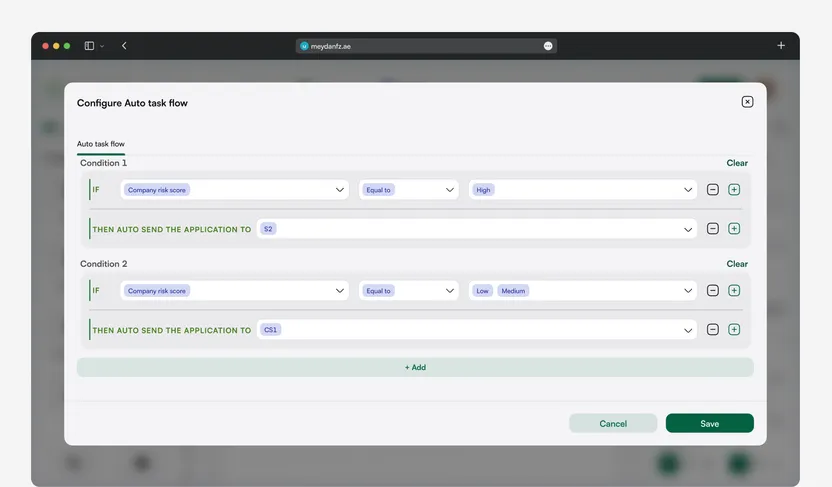
Rules that route on their own
Admins set if-then rules for each team, from "Configure auto task flow" in the team panel. If the company risk score is high, the application goes to S2. Low or medium goes to CS1. No developer in the loop.
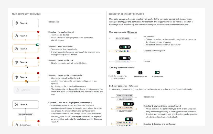
Written down for developers
Every state of the team and connector components, from hover to flow end, documented next to the designs so the builder could be built without guesswork.
The hard part. Every rule had to work in both views
Triggers, actions, time limits, rights, skill sets, parallel teams and returns to the customer had to behave the same in the map and the list. Only the view changes.
Every builder shows its rules
Forms, prices and access: each rule sits on screen, not in someone's head.
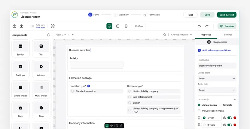
17 field types
In the form builder, with a desktop and mobile preview.
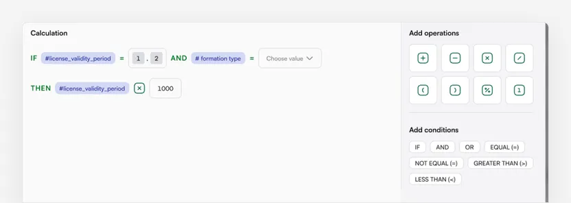
Fees as a formula
Worked out from what the customer fills in, not typed by hand.
Also built on the same idea: the email builder, document builder, content master and organisation setup.
User and role management. One login with many roles, instead of one per job
Team, sub-team and role replaced five words for the same idea.
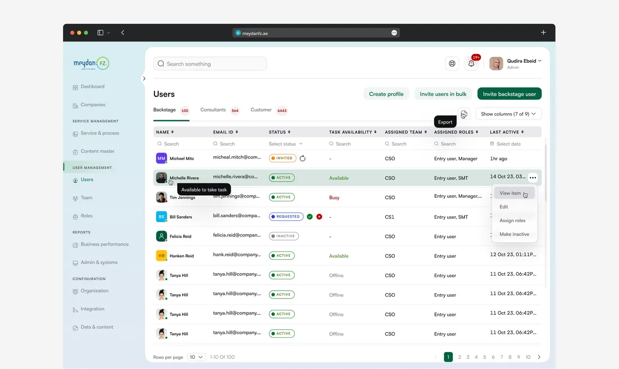
- Staff, agents, customersEach in its own tab.
- Who's free right nowAvailable, busy or offline.
- Several roles, one rowInstead of one login each.
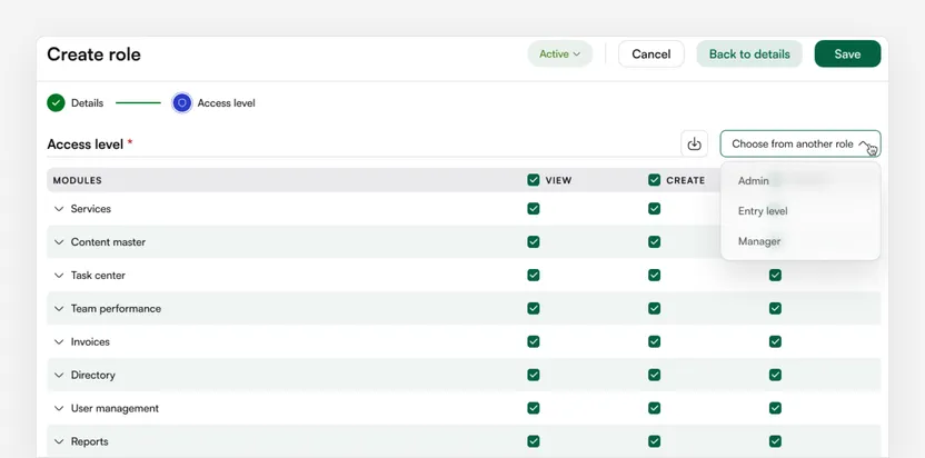
Roles start from a copy
A new role can start from an existing one, then be adjusted.
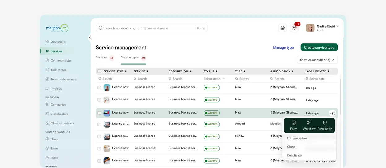
Service management. Every service set up on one page, not in slides and Excel
Admins pick a category, a service and an action, then fill in the rest. The same page tells customers what to send.
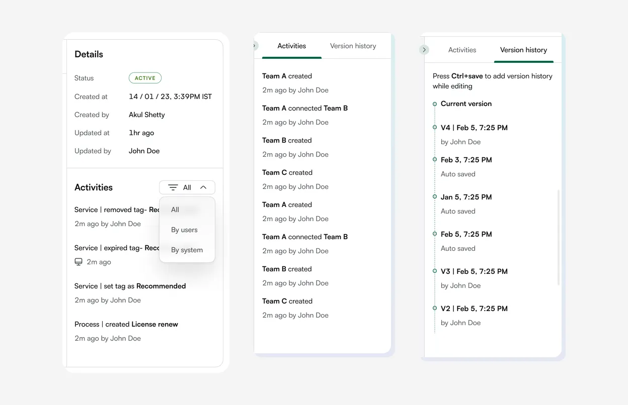
Every change leaves a record. Who made it, when, and what came before.
The old admin kept no record of who changed what. Now every service and workflow keeps one, in a panel beside the work.
3 guards against breaking live work
Where the design stops an admin before something breaks.
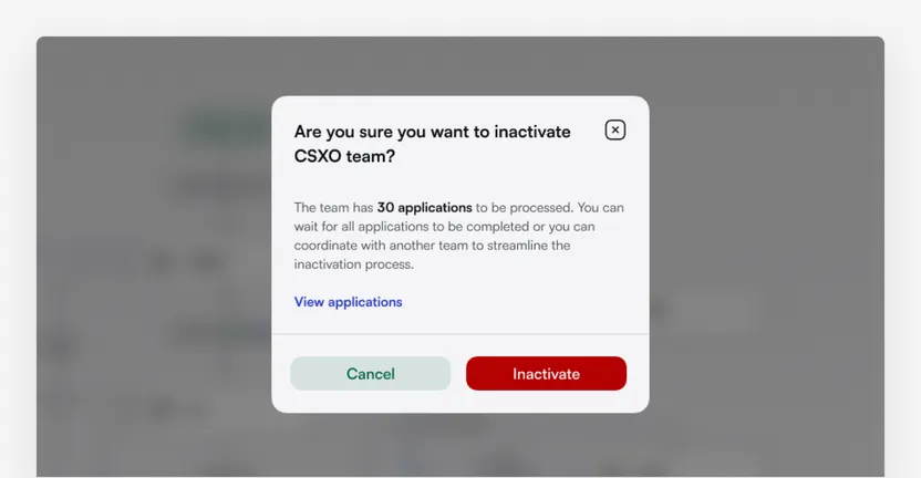
30 open applications
The warning before a busy team is switched off.
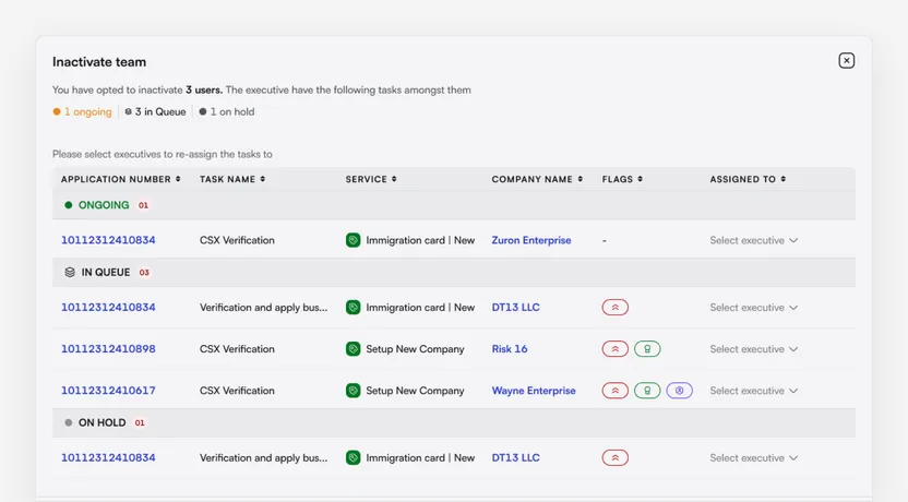
Work is handed over first
Closing a team lists every open task and asks who takes it.
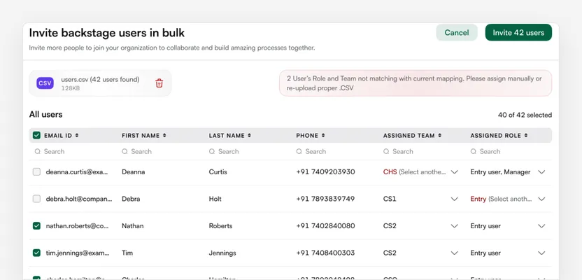
Bad CSV rows fixed in place
Rows with a wrong team or role stay unticked, with a dropdown to fix them.
One library, any client's brand
Brand colours are settings, so each zone sets its own logo and colour without new code.
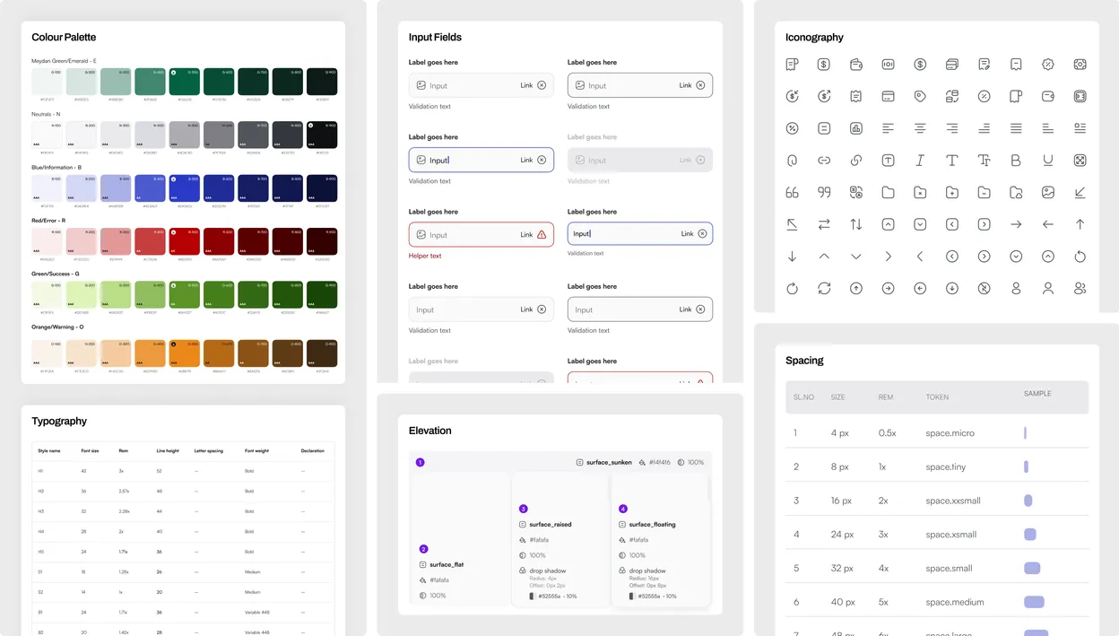
- Satoshi over ArialClearer look-alike letters, and equal-width digits for fees and dates.
- One table patternPick, filter, resize and export columns on every list.
- Never colour aloneEvery status has a text label, like Active or Busy.
Signed off and handed over in April 2024. No usage data yet.
This chapter shows what was delivered and what two admins said in testing.
What was handed over
- admin modules
- 17
- desktop screens, including states
- ~700
- review rounds on user management
- 6
Tested with two admins
- Login
- Straightforward, task completed.
- Dashboard
- "An extremely useful consolidation."
- Service setup
- Understood every data point.
- Form, email and document
- Tasks completed. Formula pricing cuts manual effort.
- Workflow
- Map view to edit, step list to start.
UI feedback report, 26 Feb 2024, with one experienced and one new admin. 12 pieces of feedback; the top ask, a short guide in each builder, was added after the test.
The flow view offers a better experience for editing and comprehending the entire flow, although it may appear complex initially.
What I got wrong. One service shape didn't fit every client.
In testing, Meydan wanted an unused field hidden, and other zones needed process types like Suspend. The brand could change per client; the service model couldn't.
Next time I'd make the service model switchable per client from day one.
What I'd keep, what I'd change.
- 01Map every rule before drawing a screenThe research told us what each builder needed.
- 02Prototype drag and drop for realA working prototype, tested with admins from a second free zone.
- 03Measure time to a live serviceAgainst the one-day goal, plus developer tickets per new service.
Still open: reporting. The report builder is still greyed out.
The project, at a glance.
- ClientEZMS, the platform behind Meydan Free Zone in Dubai, through NetBramha.
- ToolsFigma for every screen, flow and the design library. A shared sheet for the research synthesis.
Next case study
A job portal (name withheld)Four job-portal products, one design system, one switch between them.